This forum is in permanent archive mode. Our new active community can be found here.

My First Attempt At Graphic Design: Peter's Bitter Black Existence

edited February 2010 in Art!
image
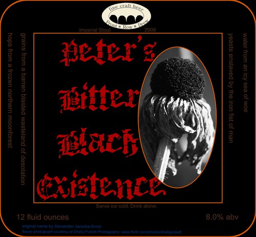
So this is the label I designed for Peter's Bitter Black Existence. This is the first time I've ever done anything like this. We have a plethora of artists on these forums, so I want some feedback. Be honest. Be brutal. I want this to be an amazing label for an amazing beer. You can view a larger version here.

EDIT: Here is a link to the photo set, in case you missed it farther down. I'm including every major modification as a separate label. If I just adjusted the symmetry of a couple of elements, that won't be uploaded as a separate label.
«13

Comments

  • Here's Version 2, based on some feedback:
    image
  • Ok, I promise brutal feedback when I get back from work :D
  • Ok, I promise brutal feedback when I get back from work :D
    Excellent.

    I've made a set to collect all the various revisions. You can access it here.
  • Like the second one better, but a few issues crop up. The "Imperial Stout" on one side of the photo and "2009" on the other side is really rather unbalanced. Symmetry and all that, you know. The sidebars also suffer from the same, but I'm not sure anyone will really pay much attention to that once it's on the bottle. I think the red on black works and I like the placement, but the lettering doesn't work at all on the gray of the photo, seems rather like a bit of "Black" was lost there. To be honest, I'm not sure I care for the photo at all.
  • To be honest, I'm not sure I care for the photo at all.
    The photo's staying, sorry. I like it. I've played around with it a bunch, though.

    You're right about the "Imperial Stout" and "2009," but I don't know what you mean about the sidebars.
  • edited February 2010
    I find it extremely hard to read any of the text except the beer's name. That may be what you were going for, but it is off-putting if you actually want to know what the beer is.

    The photo is disconnected from the rest of the label. There is no nexus between them. The photo is in grayscale, but the label is black and red. Perhaps if you changed the peripheral text to gray, instead of whatever crappy orange color it is now? You could take care of both problems that way. Also, the second cropping doesn't give you enough of the flower to get the point across. You need to go with at least as much of the photo as you have in the first label if you are going to use the photo.

    The logo is off-center, and the text needs to be arched just a little more to match the arch of the oval, but other than that it's not bad. I have a few things I'd like to try tweaking with it, but I don't have time today because I have a million things to do.

    EDIT: Oh yeah; I don't think Bitter and Black should be separated like that. Have you tried this?

    Peter's


    Bitter, Black
    Existence


    The text overlapping the photo would be fine if you had a black border to make it pop. I could totally walk you through doing that in raster, but I don't know how to do it in vector. It's not the same thing as stroke. I guess you could try duplicating the text, turning the text on the back layer black, and off-setting it slightly.
    Post edited by Nuri on
  • edited February 2010
    Funny enough, that's pretty much everything Shelly (the photographer) said.

    As I said, I've made several revisions. Here's my current best effort:
    image
    I still need to balance the "Imperial Stout" and "2009," but that's pretty minor.

    EDIT: Fixed some centering and balancing issues. Say hello to Revision 7:
    image
    Post edited by TheWhaleShark on
  • That's easy. Put the season in front of the 2009 to fill it out.

    Now the red text is disconnected. The blue attribution text looks out of place. Changing the attribution text to red might help pull it together. You need something red outside the gray box.
  • edited February 2010
    This is my thoughts on the front, It's still pretty rough:
    image
    Don't use absolute black for the background, it stands out to much when there's a lot of it together.
    Keep it to just what people want to know. If unsure, leave it out.
    If you get the hang of PagePlus, it makes knocking up things like this really quick.
    The photo is from here.
    Post edited by Omnutia on
  • Are you using Photoshop for this? If you expect to print these out, and you want the colors to be right, you have to do all sorts of CMYK finagling, which only the full version of Photoshop can do.

    If you're not going to do that, and you'll just print on a deskjet or whatever, then you have to pick colors that are far more different than each other. Right now the gray is really hard to read on that black. When you print it will probably be even harder to read. Also keep in mind that if your monitor isn't IPS (you don't have UltraSharp do you?) and isn't calibrated, that the printed result will be even more different from what you see on your screen.
  • edited February 2010
    Changing the attribution text to red might help pull it together. You need something red outside the gray box.
    Good thought.
    Are you using Photoshop for this?
    Inkscape.
    Right now the gray is really hard to read on that black.
    Actually, I thought that too. That's a 70% gray. I may change it to 50% or 40% to lighten it up.
    you don't have UltraSharp do you?
    Actually, I do.

    EDIT:
    Don't use absolute black for the background, it stands out to much when there's a lot of it together.
    Keep it to just what people want to know. If unsure, leave it out.
    I disagree about the black background. I very much want the contrast to be that extreme, and it's also called "Peter's Bitter Black Existence;" there better be lots of black on the label.

    Your design is neat, but it's sort of a weird middle ground in terms of "stuff." Most beer labels are either a lot busier, or a lot more minimalist. Take Mikkeller Black as an example. Compare it to Stone's Oaked Arrogant Bastard Label. The Stone Label is even a little clean as far as beer labels go, but you can see that it's significantly busier than the Mikkeller label. I feel like your proposal falls in between the two.

    EDIT: Try this one.
    image
    Post edited by TheWhaleShark on
  • Are you going for a minimalistic approach? Have you considered other shapes for the label, like ovals or a oval with rectangles at the sides? Is this a limited label run(as in: you have no problem cutting the labels by hand)? Where are you going to print this?
  • Are you going for a minimalistic approach?
    I'm going for a "clean" approach, more akin to a Stone label. If that label were to be wrapped onto a bottle, the only thing you'd really see would be the middle square. I'm trying to keep that clean.
    Have you considered other shapes for the label, like ovals or a oval with rectangles at the sides?
    I played around with other shapes, but I didn't like them. I prefer square-ish beer labels anyhow.
    Is this a limited label run(as in: you have no problem cutting the labels by hand)?
    Extremely so. I brew 5 gallon batches, which yields 48 - 52 12 ounce bottles.
    Where are you going to print this?
    Not sure yet, but we have some very high-quality color laser printers at work.
  • That is looking much better. Now that they are readable, the text in the side columns looks unbalanced because there is so much more on the left side. Can you space out the sentences on the right side to sort of match the left?
  • That is looking much better. Now that they are readable, the text in the side columns looks unbalanced because there is so much more on the left side. Can you space out the sentences on the right side to sort of match the left?
    Yeah, I can do that. I also think that the bottom of the label is a little heavy on the left. What do you think about centering the attribution text?
  • I'm not a huge fan of the main font used for the name. Any chance there is another font that is more readable, yet still achieves the style you are looking for?
  • edited February 2010
    Could work. The red makes it less obtrusive, so I think it's okay, but centering it might help make the whole thing more balanced.
    I'm not a huge fan of the main font used for the name. Any chance there is another font that is more readable, yet still achieves the style you are looking for?
    Me neither, but he loves that font. I don't know how long he spent looking.
    Post edited by Nuri on
  • I'm not a huge fan of the main font used for the name. Any chance there is another font that is more readable, yet still achieves the style you are looking for?
    There are a few. That one is Death Fucking Metal from DaFont. I also toyed with the idea of using Tfu Tfu. I'll give it a go and see.
  • image
    I like Tfu Tfu a touch more, but it's a little messier. Overall, they're about equal in my mind.
  • It's significantly more readable, though. I like the way it emphasizes Existence. Can you save the logo as a separate image and send it to me? The fact that it looks like tombstones is bothering me.

    The difference between the current incarnation and the first one you posted is pretty amazing. This one looks like it could actually be put on a commercial bottle.
  • The fact that it looks like tombstones is bothering me.
    I noticed that too. I was thinking of maybe adding a projection screen or something above the seats so it emphasizes the "Front Row" aspect.
    This one looks like it could actually be put on a commercial bottle.
    Why thank you! And thanks to everyone else for their feedback. This is definitely a lot better.
  • The fact that it looks like tombstones is bothering me.
    I noticed that too. I was thinking of maybe adding a projection screen or something above the seats so it emphasizes the "Front Row" aspect.
    Exactly what I was thinking. See email.
  • A coworker suggested that the text about how to pour the beer is too helpful. He suggested making it cynical or belittling. I had thought about that before, and the helpful directions do feel a little out of place with the rest of the "feel" of the label.

    Maybe something like this:

    "This infernal concoction froths with the hate of imprisoned yeast. You would do well to leave them behind, for their wrath is terrible and you are too weak to handle it. Consider yourself warned."
  • "This infernal concoction froths with the hate of imprisoned yeast. You would do well to leave them behind, for their wrath is terrible and you are too weak to handle it. Consider yourself warned."
    You should try selling this to some of the Goth bars in Camden Market, the sort of thing that they all love. Indie Beer with dark styling is something I would have at any party of mine.
  • You should try selling this
    Yeah, selling homebrew is pretty much impossible, at least in New York. You have to at least have a microbrewery license, and that costs at least $1,000/year. That also covers production up to 60,000 bbl, so it's way more than I would ever use. Plus, the brewery has to be commercially zoned, so I can't sell beer that I brew in my own house.

    Technically, it's illegal to even give it away.
  • edited February 2010
    "This infernal concoction froths with the hate of imprisoned yeast. You would do well to leave them behind, for their wrath is terrible and you are too weak to handle it. Consider yourself warned."
    You should try selling this to some of the Goth bars in Camden Market, the sort of thing that they all love. Indie Beer with dark styling is something I would have at any party of mine.
    It also wouldn't hurt to get in contact with Galco's. While they're primarily known for their soda selection, they also carry a big selection of beers from independent bottlers. At the very least, the guy who runs the store is really nice and knowledgeable and could probably give you some advice on how to get your brew out there. Even by less-than-legal means, because they definitely sell some stuff that operates underground.

    Of course, you do work very closely to the health and safety regulations, so operating an underground bottler might not be something you want to do on principle.
    Post edited by Sail on
  • edited February 2010
    Ok, here is my take, its a bit rushed, but it's so you can get the general idea:
    image
    The first one has the whole "This infernal concoction..." on a separate label in the back
    image
    This one has the legend on it.

    -People like squares and boxed stuff, so the ounce and alcohol level kinda threw it off since everything seems to follow a strict reticule except that, so as you can see, I shortened it to the abbreviations.
    -I lowered the "Front Row Brew" to touch and to break the gray framed Box and to add some integration with whatever is outside the square, I also shortened the gray box as well.
    -You can see that by putting the "Imperial stout" in two different lines, you avoid the balance problem, so if you just want to put in the year on the other side, now you could do it.
    -I flipped the text with the description of the ingredients as I don't think that it should be part of the design of the label, its just fun info to read, so by flipping it, you break up the design into two parts but it keeps it integrated (if that makes any sense, I'm not that good at technical stuff in English.)
    -I would advice against using a "serif" font on the info texts as it's harder to read in smaller sizes, you should also up the contrast a bit with a lighter shade of gray
    -I also believe that some art nouveau ish swirls as separators would work well with the theme of the label (not the ones I used, those kinda suck, but again, you get the idea)
    Post edited by MrRoboto on
  • edited February 2010
    The smoothness of the oval is off-putting when compared to the rest of the design, especially in contrast with the scratchiness of the text. I would grunge up those edges. It could be as simple of taking the original square image and, using the oval as a guide layer, color in the corners of the image with strokes of uneven length, so it is black around the outside, but the sketchy lines give way to the photo near the center. Right now it looks too much like a photo you would put in a locket or something. Same goes for the white border. It's not as bad, but I think something that looks like it was drawn in ink might be better. I would choose and more hand-written font for Imperial stout and spring 2009. If you want to send me the font (or a link if it is free) and the original photograph of the flower, and the text, I might be able to spruce it up a bit. Installing my new creative suite tonight, so it will give me something to test CS4 on. Also, give me the PS file. Might as well.
    Post edited by gomidog on
  • I think the latest revision is very aesthetically pleasing. Already I can feel my hope for tomorrow draining away...or maybe it's my 8th straight opening shift beginning in several hours.

    In either case, I think it's an excellent design. My gut is telling me it might be safe to blur the edges of the pictured flower, have the image itself blending and melting into the solid blackness behind it, threatening and engulfing. My stomach, on the other hand, says to drink the beer.
  • edited February 2010
    Emily, he is not using Photoshop. He is using some vector program called Inkscape. Also, the link to the font is posted above. If it was PS, I would just send over my grunge brush set for the edges of the photo.

    I would also warn against including too many different fonts in the label. A big rule of design is to not overmix fonts. 2 is pushing it; 3 is almost always too much.
    Post edited by Nuri on
Sign In or Register to comment.