This forum is in permanent archive mode. Our new active community can be found here.

New Site

edited February 2007 in GeekNights
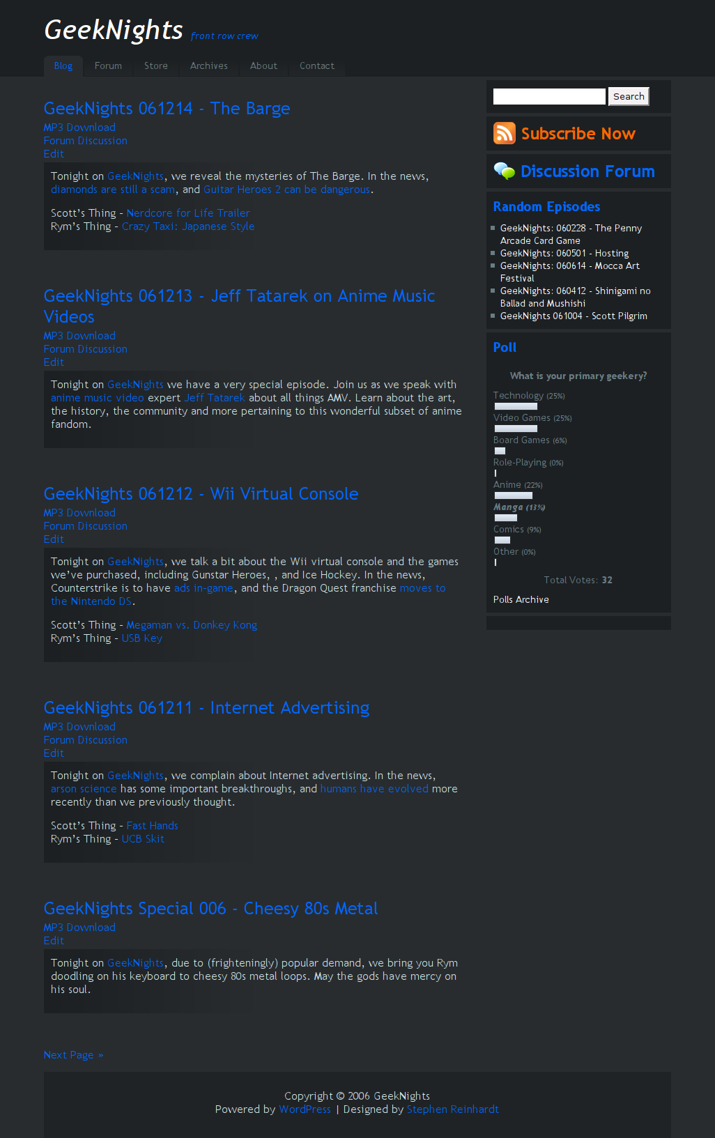
As you may know, we've been working on a new theme for the site. Since I don't have to work until March 1st, I'm going to be spending quite a bit of time on doing stuff for the show. Recently I found a WordPress theme I like, and I have been modifying it into a decent replacement for the current theme of frontrowcrew.com. Here's a screenshot of what it looks like right now.
image
Nothing here is set in stone or anything. This is just what I'm fooling around with on the development server. Please express your opinion.

Comments

  • edited February 2007
    As if! Black is, like, so 1995. I really like the clean white Mac-ish color scheme or, failing that, something bright and solid. One man-child's humble opinion.
    Post edited by Jason on
  • Black is good for the environment since it requires less electricity to display.

    GeekNights the eco-friendly site
  • edited February 2007
    Black is good. I like black. Can't get enough.

    Can you do that black silk sheet thing?


    After looking awhile, I take that back. It's harder to read than a white background. Please keep a white background.
    Post edited by HungryJoe on
  • Oooooh, I likes me that blackness. Keep the black. Or maybe have multiple themes (for the forum, at any rate) that the members can choose from. But keep the black. Or dark blue, to go with the nite-time show-ness.
  • edited February 2007
    It looks nice. My only concern is how it's gonna work with the forum and readability.
    Post edited by Sail on
  • I really like the new theme.
  • Forum's not changing. ^_~
  • Good. I hate trying to read dark forums.
  • Well, whatever theme we pick, we're going to change the heading of the forum to match the site. Other than that, the forum won't change much.
  • I kinda like the site as it is, but this isn't a bad design. Reminds me of OC Remix a bit. I would prefer keeping the light colors, I've gotten so used to Geeknights having the nice clean page as HJ said. Also, do you ever plan on integrating your logo into the page?
  • Hey, yeah, is there a logo yet (even just a concept?) or is that still up in the air?
  • No, there's no logo still. Also, you think the current site is a nice clean page? It's so cluttered, omg.
  • I like the black. Dark background + light font = teh goodness.
  • edited February 2007
    So the picture I see if I click on the feed isn't a logo?
    Post edited by Hitman Hart on
  • Scott, I don't know if I am hitting the nail on the head here or anything, but as soon as I saw that screen shot I said, yeah, night, this totally makes sense. Subconsciously all the colors coordinated, and alluded to a night-scape.
  • Do you want a logo? I have a few ideas...
  • So this isn't a logo?
  • I too prefer the lighter colors as they are easier to read and easy on the eyes. Whatever design you choose, please keep the current concept of having things being easy to find and navigate.

    I had to laugh when Rym was talking about feeling like an old man due to something that happened back in the 90s. He's 25 or so. Try being born back in the 60s and listening to this show. Now that makes you feel old!

    It is ironic but Scott will probably end up working harder on the redesign during the time he is unemployed than he did when reporting to his last job.
Sign In or Register to comment.