Howdy, Stranger!
It looks like you're new here. If you want to get involved, click one of these buttons!
This forum is in permanent archive mode. Our new active community can be found here.
BLAZING SPIRITS by Li_Akahi
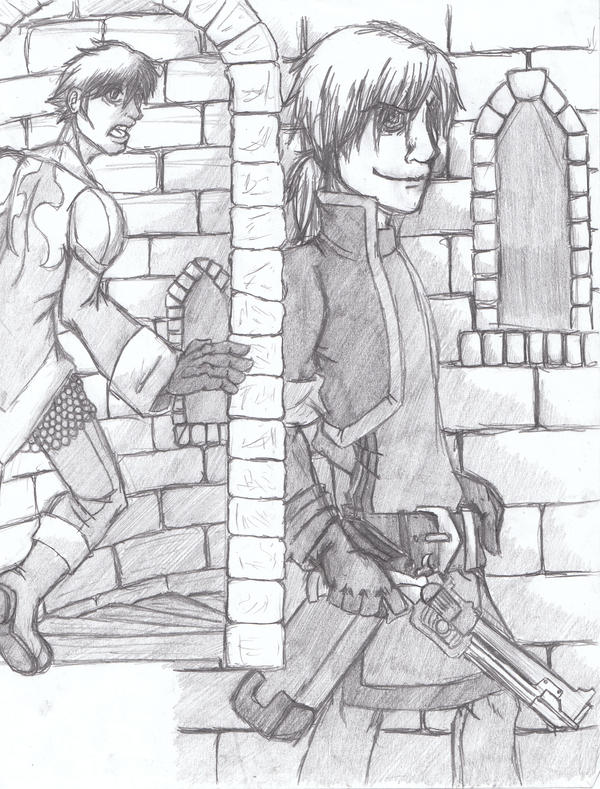
I am not a shit-talker, here is chapter 1-page 1 of the comic I have been trying to start for around 5 years:

I will try to have at least one more page posted on my DeviantArt within the week. I am in college so I have a fairly busy schedule. Please give me some feedback (if possible from only one page)!

I will try to have at least one more page posted on my DeviantArt within the week. I am in college so I have a fairly busy schedule. Please give me some feedback (if possible from only one page)!

Comments
Anyway, the guy running looks kinda akward. I really like this 1st page layout. The costumes are cool! Work on the bodies a bit more. Try some inking and toning, but in practice first.
MORE PAGES ARRGGHG! YAY! <-- That means I like it.
Ugly white space in corner is ugly. If you intend to put text there, think it over, everything in the page reads to the right, placing text in that corner would just blend and disappear with the BG.
If you are sticking with pencil, you have to learn to shade better and learn how to use contrast in your advantage, case in point, the character on the right, even though his suit has all this detail, nothing pops out, and just looks like a gray mass.
I'll add some more comments later, when I get home.
Pretty solid drawing overall, though I think you need to work on your drapery and folds. One thing that really sticks out to me is the fold behind his knee in panel 1. Those lines should basically be flipped upside down. It's really defining the form incorrectly as it is.
As for the page layout, it's a big confusing. You can't tell at a glance that these are separate panels. Additionally, it's difficult to tell what's happening. We just have two guys facing the same direction, with no context. A larger establishing shot would be really useful here.
I also agree with the others who said that the pencil work is muddy. If you're going to leave it in pencil, I'd suggest going a lot darker with your lines, and lighter with your gray tones, except for dark accents, like where you might spot blacks if you were inking. It does all kinda blend together into a gray mass.
I hope it doesn't seem like I'm picking on you. I'd really like to see you improve these things. Good luck.
Better? Worse?
I redrew the lines on the characters and made them thicker and darker. I also cleaned up some stray lines and redrew the character on the right's face as it displeased me. I also made some changes that were suggested above. If this doesn't work out I might redraw the entire page and actually ink it instead of leaving it in pencil.
Also, check the anatomy on the guy on the left, his right arm is bending weird, rotate the chest a bit and add the left hand so he looks balanced.
It kinda looks crappy, but burn and dodge kinda suck, its just to get the idea across.
Draw from life, start to draw what surrounds you, you'll learn perspective, anatomy, balance, etc.