Howdy, Stranger!
It looks like you're new here. If you want to get involved, click one of these buttons!
This forum is in permanent archive mode. Our new active community can be found here.
Critique this?
I need some second opinions or help on creating a logo. I've been sketching and trying a lot of things in Photoshop for my comic site and studying logo design. Here's what I got:
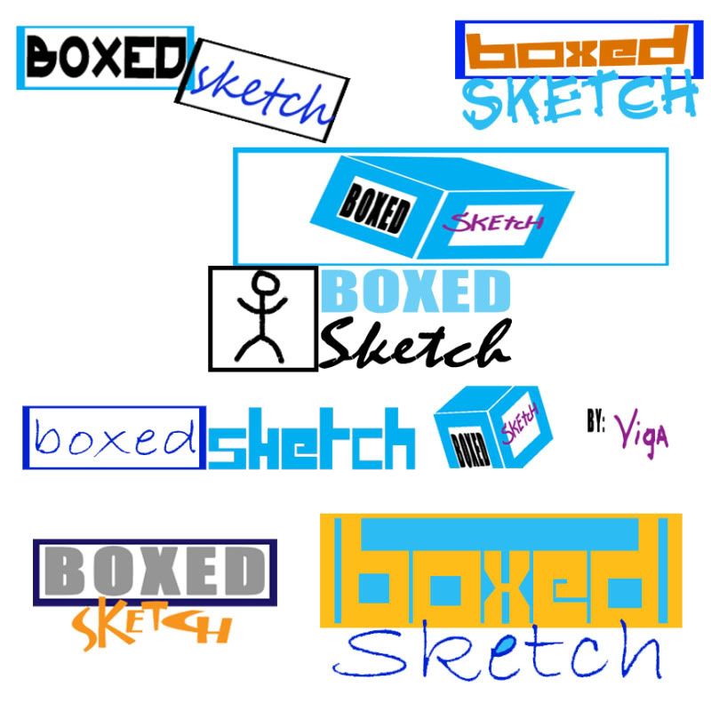
One of them I'm presently using. It's the latest one. I still haven't pinpointed one. Thus the need for input.
One of them I'm presently using. It's the latest one. I still haven't pinpointed one. Thus the need for input.
Comments
BTW Viga, I love the humour in your comic
1- Skewed letters and a graphic bigger than the actual letters themselves, both are to be avoided.
2- Seems you are giving emphasis to the box and not the letters themselves, they look like an afterthought and should be the important part.
3- Its ok to change the fonts for the different words, but know that when you do, they compete against each other, so not only is the BOXED in the box in bolder letters and bigger lengthwise, its also on top of the other word, so in context someone might just read BOXED and then sketch as a sub text perhaps referring to a section.
4- For the ones marked with the number four, you chose colors of similar brightness so the logos even though they have different colors, seem bland and boring, create a bit more contrast in your designs (the biggest offender is the last one) an easy way to check for this is simply to desaturate the whole thing as I did and check to see if it blends into a single block.
*Circled stuff- As with most script fonts, the designers should fill in those gaps in between the letters, remember, its all about details
*Squiggly lines- Avoid tangents in your designs so that either stuff overlaps or its apart, not just barely touching.
Could use more comic sans. ~_^
So after reading your stuff and what everyone liked I made more. I brought back some of the logos to compare. So far I grown attached to the second right one.
Whoa! Nice, but it doesn't match the site's colors. Plus it reads as Bsketchxed? B-Sketch-xed? B(Sketch)xed? Flaming skull gif included. :P