This forum is in permanent archive mode. Our new active community can be found here.

RFC - New design for frontrowcrew.com

edited January 2008 in GeekNights
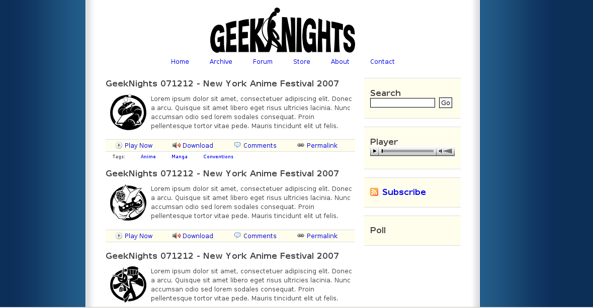
Since time immemorial we have talked about how we are making things like swag and new web sites. To this day, we still don't have much to show for it. This is why we never give absolute dates of when these things will appear. However, I assure you we are working hard on them. To prove it, here is a recent screen of the new design for the web site. I think we're definitely taking it in a direction we are happy with, and I think it's pretty good considering that I don't have a single graphic design bone in my body. You people are going to be using this site more than I will, so take this chance to comment on it. Click the image to see it full sized.

image
«1

Comments

  • I love the simplicity of it, and the logo positions. I think the tags would look better under the title of the show, though that may interrupt the show-description text.
  • The main body really does look clean and user friendly. Definitely it's an improvement over the current page (hearing how people cant find the "Geeknights" link for the episiodes). Are there gonna to be more things coming on the sides instead of the blue?
  • edited January 2008
    Yes, yes, yes, yes, and more yes. This design is great.
    Post edited by Sail on
  • edited January 2008
    Layout is so-so, definitely easier to understand.
    Could you show us what it looks like with the logos similar to the colour of the side background?
    Post edited by Omnutia on
  • I like it. It's very simple, and slick, very web 2.31415926589.
  • edited January 2008
    Naaa, I'd say more web 2.161803399
    [Afterthought: Would the golden section make a website more appealing to the eye?]
    Post edited by Omnutia on
  • I like this one better... Oh well, good job.
  • Its very well done Scott. Nice job. Thumbs up from me
  • The Layout, Yes. The Graphics, No. Just doesn't match up.
  • I really like it, actually. "Professional Minimalist" style. The icon for anime is pretty awesome, made me 'lol'.

    Don't often see Lorem Ipsum being used rather than "CONTENT HERE" repeated, which is what I often see.
  • Yes, yes, yes, yes, and more yes. This design is great.
    stamp of approval
    What can I say besides that? Looks way more awesome then the previous design, and that was already neat. Though do try to put the tags directly under the episode title as MitchyD suggested, at least for easier comparison.
  • edited January 2008
    Ugh, I like the old style better

    To be a bit more constructive about it, I think the sidebar stuff is too big.
    Post edited by Cremlian on
  • Ugh, I like the old style better

    To be a bit more constructive about it past that, I think the sidebar stuff is too big.
    How can anyone like the current style? It's a cluttered useless mess.
    Though do try to put the tags directly under the episode title as MitchyD suggested, at least for easier comparison.
    I also don't like the way the tags look. I've tried putting them all over, and they don't seem to fit in. I think I'm just not going to show them at all. However, if you go to a page for just one episode, then that episode's tags will appear in a tag cloud kind of thing.
  • Could you show us what it looks like with the logos similar to the colour of the side background?
    image
  • I think I'm just not going to show them at all. However, if you go to a page for just one episode, then that episode's tags will appear in a tag cloud kind of thing.
    Ah, that's a very good idea. And that last screen is awesome. Changing the colours of the logos to make them blend better looks indeed best.
  • I like the change you did at the top in that last screenshot. Apart from that I'm not sure which of the two last versions I like more. They are both very good!

    I am not completely satisfied with the placement of the Play now/Download/Comment/Permalink line. It's so close to the title of the episode below that some people might be confused about which episode the line belongs to. I think increasing the space below by a few pixels will clarify.

    Keep up the good work - you're nearly there!
  • I like it. You did a good job. I like the second change most.
  • edited January 2008
    The latest version looks really great now even the orange parts integrate nicely.

    The spacing of the blog entries could be improved, making the single entries more compact.

    Edit: Wow just looked at the current theme, now I'm really waiting for the re-design.
    Post edited by Jain7th on
  • In the second image, you removed the tags. I liked having the category tags because it made it easier to search for old episodes if I didn't know the exact title. If there is a way to keep that tags, that'd be great, otherwise the site looks great!
  • Could you show us what it looks like with the logos similar to the colour of the side background?
    image
    Could you do one more with the title logo still in black?
  • I liked the contrast of the black in the first screenshot.

    When clicking on "Play Now" will it load the song into the player on the right? That would be pretty nifty.
  • I fucking hate it. What's with all this "design" shit? We just need straight up text. Forget graphics.
  • edited January 2008
    We don't need a website, it's too much extra baggage. Just make us a blank screen with a command prompt on it.
    Post edited by Sail on
  • We don't need a website, it's too much extra baggage. Just make us a blank screen with a command prompt on it.
    ~Signed~
  • When clicking on "Play Now" will it load the song into the player on the right? That would be pretty nifty.
    Yes, what did you think it does?
  • This new layout is simple and you don't get lost like you did in the "mess" of the current layout.

    I don't know what your current goals are with this current revision. For the most part, I understood you wanted it to suck less. With this new layout you've tidied up and clean out a lot of the content. Great! People don't get lost when they go to your site. Awesome! Now if you want people to come to your site and get a good impression of you, like that 5 second rule you mentioned, well you still fall flat on that realm.

    Your doesn't have any personality. The icons have a lot of personality and it seems like there was more time spent on the icons rather than the site itself. It looks like a standard layout that you guys try to spruce up with icons. For example, the color combinations looks old. Standard link blue with black lettering.

    Again, this new layout is fine since it gives me the information in a neat organized fashion. In a future revision, you might want to think about the things I said earlier.
  • Again, this new layout is fine since it gives me the information in a neat organized fashion. In a future revision, you might want to think about the things I said earlier.
    We want to do things like that, we just don't know how.
  • Just make a paragraph at the top under the logo like this.

    You are now at GeekNights, a podcast for multidimensional geeks! Shows are released 4 times a week Monday- Thursday. Shows range from 45-60 minutes. We discuss games, technology.....

    And continue on.
  • This new layout is simple and you don't get lost like you did in the "mess" of the current layout.

    I don't know what your current goals are with this current revision. For the most part, I understood you wanted it to suck less. With this new layout you've tidied up and clean out a lot of the content. Great! People don't get lost when they go to your site. Awesome! Now if you want people to come to your site and get a good impression of you, like that 5 second rule you mentioned, well you still fall flat on that realm.

    Your doesn't have any personality. The icons have a lot of personality and it seems like there was more time spent on the icons rather than the site itself. It looks like a standard layout that you guys try to spruce up with icons. For example, the color combinations looks old. Standard link blue with black lettering.

    Again, this new layout is fine since it gives me the information in a neat organized fashion. In a future revision, you might want to think about the things I said earlier.
    The actual thing they are doing is the podcast, the website, for the greatest part, is there for the links and to give people an option to subscribe to the feed, which they like best, if their feed aggregator doesn't have a browser.

    I agree with Eric, the information, where you currently are, should be given to you right away.

    If you need some inspiration, you should look at the Rookie Designer Website . It's easy for the eyes to browse through the episodes, when you found one that interests you, you read about the actual content of the podcast, with the headers showing you where you hear what in the show. Then one decides to download or listen to the episode or even to subscribe to the podcast. With the design you decide where your visitor should look and where they should go next.

    The current new design cramps everything together, maybe use bubbles or shapes as backgrounds for the different parts.
Sign In or Register to comment.