Howdy, Stranger!
It looks like you're new here. If you want to get involved, click one of these buttons!
This forum is in permanent archive mode. Our new active community can be found here.
Web Project Help
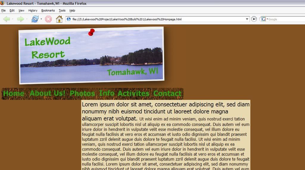
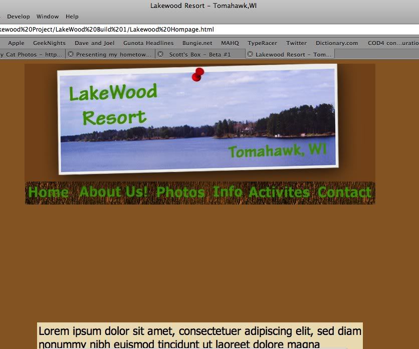
I'm doing a project for school and I'm having trouble getting to to look the same in IE 6 & 7, Firefox 2, and Safari.
One big problem is the alignment, it looks centered in IE 7 & 6, and Safari, but it is not the same for Firefox.
Firefox Problem, It's suppose to be centered;

sorry no IE 6 image. >_<
One other problem that I'm having, is that the top Image background color in safari doesn't match, I used the same hex color and safari doesn't like it. So I went into photoshop and made the background transparent and saved it as a PNG-24. Then I changed the code to the new image and it worked for all the browsers, but IE 6 that my school is using doesn't like it and instead ignores the background transparency.
Safari and IE 6 problem:

This project is a client website for a mom and pop cabin in northern wisconsin. It's just a simple web site with some HTML and CSS.
I just want to say that I'm not the best web coder and my HTML style may not be the best. So ignore the anything that is a minor problem.
I would greatly appreciate any help from you web coding masters.
Make corrections in red please:
So here is the code:
And here is the CSS sheet:
One big problem is the alignment, it looks centered in IE 7 & 6, and Safari, but it is not the same for Firefox.
Firefox Problem, It's suppose to be centered;

sorry no IE 6 image. >_<
One other problem that I'm having, is that the top Image background color in safari doesn't match, I used the same hex color and safari doesn't like it. So I went into photoshop and made the background transparent and saved it as a PNG-24. Then I changed the code to the new image and it worked for all the browsers, but IE 6 that my school is using doesn't like it and instead ignores the background transparency.
Safari and IE 6 problem:

This project is a client website for a mom and pop cabin in northern wisconsin. It's just a simple web site with some HTML and CSS.
I just want to say that I'm not the best web coder and my HTML style may not be the best. So ignore the anything that is a minor problem.
I would greatly appreciate any help from you web coding masters.
Make corrections in red please:
So here is the code:
<html>
<head>
<title>Lakewood Resort - Tomahawk,WI</title>
<link href="lakewoodstyle.css" rel="stylesheet" type="text/css">
</head>
<!---This page is developed and best view at 800x600 ratio---->

<Body bgcolor="#845322" align="center" valign="top">

<!---this is the master table--->
<Table Width="700px" align="Center" valign="top" col="1" border="0px" class="mtable" cellspacing="0px">

	<TR valign="Top" align="Center" width="700px" height="235px">
		<IMG Width="700px" SRC="Main1top.jpg" Border="0px"><br>

		<!--<TR valign="Top" align="Center" width="700px" height="46px">-->
		<IMG SRC="navigation bar.jpg" USEMAP="#navbar" border="0px">

			<MAP NAME="navbar">
				<!--Home Page-->
				<AREA SHAPE="rectangle" COORDS="0,0,97,46" HREF="Lakewood Homepage.html">

				<!--About-->
				<AREA SHAPE="rectangle" COORDS="97,0,253,46" HREF="About.html">

				<!--Photo gallery-->
				<AREA SHAPE="rectangle" COORDS="253,0,366,46" HREF="Photo.html">


				<!--Infomation-->
				<AREA SHAPE="rectangle" COORDS="366,0,440,46" HREF="Info.html">


				<!--Activites-->
				<AREA SHAPE="rectangle" COORDS="440,0,577,46" HREF="Activites.html">


				<!--Contact-->
				<AREA SHAPE="rectangle" COORDS="577,0,699,46" HREF="Contact.html">
			</map>

	</TR>
	<TR>
		<Table align="Center" Width="650px" border="0px" class="nTable1">
			<TD Width="650px" align="Center">
				<P valign="top" align="left" Class="custfnt2">Lorem ipsum dolor sit amet, consectetuer adipiscing elit, sed diam nonummy nibh euismod tincidunt ut laoreet dolore magna aliquam erat volutpat.
				<Font Class="custfnt3">Ut wisi enim ad minim veniam, quis nostrud exerci tation ullamcorper suscipit lobortis nisl ut aliquip ex ea commodo consequat. Duis autem vel eum iriure dolor in hendrerit in vulputate velit esse molestie consequat, vel illum dolore eu feugiat nulla facilisis at vero eros et accumsan et iusto odio dignissim qui blandit praesent luptatum zzril delenit augue duis dolore te feugait nulla facilisi.
Ut wisi enim ad minim veniam, quis nostrud exerci tation ullamcorper suscipit lobortis nisl ut aliquip ex ea commodo consequat. Duis autem vel eum iriure dolor in hendrerit in vulputate velit esse molestie consequat, vel illum dolore eu feugiat nulla facilisis at vero eros et accumsan et iusto odio dignissim qui blandit praesent luptatum zzril delenit augue duis dolore te feugait nulla facilisi. Lorem ipsum dolor sit amet, consectetuer adipiscing elit, sed diam nonummy nibh euismod tincidunt ut laoreet dolore magna aliquam erat volutpat.
Duis autem vel eum iriure dolor in hendrerit in vulputate velit esse molestie consequat, vel illum dolore eu feugiat nulla facilisis at vero eros et accumsan et iusto odio dignissim qui blandit praesent luptatum zzril delenit augue duis dolore te feugait nulla facilisi. Lorem ipsum dolor sit amet, consectetuer adipiscing elit, sed diam nonummy nibh euismod tincidunt ut laoreet dolore magna aliquam erat volutpat. Ut wisi enim ad minim veniam, quis nostrud exerci tation ullamcorper suscipit lobortis nisl ut aliquip ex ea commodo consequat.
Lorem ipsum dolor sit amet, consectetuer adipiscing elit, sed diam nonummy nibh euismod tincidunt ut laoreet dolore magna aliquam erat volutpat. Ut wisi enim ad minim veniam, quis nostrud exerci tation ullamcorper suscipit lobortis nisl ut aliquip ex ea commodo consequat. Duis autem vel eum iriure dolor in hendrerit in vulputate velit esse molestie consequat, vel illum dolore eu feugiat nulla facilisis at vero eros et accumsan et iusto odio dignissim qui blandit praesent luptatum zzril delenit augue duis dolore te feugait nulla facilisi.</P></TD>
		</Table>
	</TR>
</Table>
</Body>
</html>
And here is the CSS sheet:
/*Master and Slave Tables Style Rules*/
.mtable {
	text-align: center or inherit
}

}
.subtable {
	background-color: #cc6600;
}

.nTable1 {
	Background-color: #e9d9b1;
	Text-align: center or inherit;
	Vertical-align: Top;

}

/*Custom Color Style Rules*/
.custclr {
	background-color: black;

}

/* Font Style Rules */
.custfnt1{
	font-size: 36px;
	color: #000000;
	font-family: tahoma;
	text-align: center;


}
.custfnt2{
	font-size: 22px;
	color: #000000;
	font-family: tahoma;
	text-align: center or inherit;
}
.custfnt3{
	font-size: 16px;
	color: #000000;
	font-family: tahoma;
	text-align: left or inherit;
}
.custfnt4 {
	font-size: 12px;
	color: #000000;
	font-family: tahoma;
	text-align: left or inherit;
}

/* Link pseudo-class style rules */
a:link {
color: #660000;
}
a:visited {
color: #990000;
}
a:hover {
color: #000000;
}
a:active {
color: #FF0000;
}
Comments
DON'T USE TABLES FOR LAYOUT.
Firefox 2 not displaying your stuff as you expect it to do means you are doing it wrong. If it works in IE6, wooptidoo, that browser hates standards, as does IE7, only to a lesser extent. Safari has something with color profiles, I don't remember exactly what it was anymore, but it's the reason why your image(s) looks wrong, it probably means Safari's default color profile is the culprit there.
Image maps??? Why not just cut the image into seperate buttons if you're going to use it for that? I've never seen the use in image maps, they are obsolete. Yeah, bullshit, you're not developing it for an 800x600 aspect ratio, you're developing a site where the recommended minimum screen _resolution_ is 800 by 600 pixels. And even then you only care about the width.
Lessee, what else is there to nitpick quickly... meh, not much, please learn some proper html and for fucks sake, cut off the Lorem Ipsum crap, "Lorem Ipsum dolor sit amet..." is ENOUGH, delete the rest of that text in that code block, it only fucks up the site.
Good luck learning html.
EDIT: What was that website philosophy again? Content in the .html file, styling in the .css file. Have you ever turned css off on some sites? Have you seen that they look like crap then? Lay-out wise? That's because there's only content on those pages if you turn the css off. How did you get that job in the first place?
As for Image Map, it was only temporay, now it's gone. As For tables, Tough shit, the project is due in 3 days I i don't have time tho learn
Secondly, I capitalize tags because it's an old habit from my HTML and Visual Basic days.
good reading...lol
Although thanks for some advice, I wish some would help me fix the problem not criticize me.
Hooray!!!
I'm In 3rd Beta ^_^
I'll worry about alignment and sizing issues later.
Much more to do, Now I have to do make a photo gallery, a contact page with a email form, and possibly a reservation calender.
Heres (raising Monster energy drink) to more coding and head bashing. ^_< !
Also, I thought I had skimmed over it... but where the hell is your DOCTYPE? If you say anything along the lines of "What's a DOCTYPE?" then you seriously need to resign from the class for you haven't learned a thing, and if it wasn't taught in the class, you've wasted your time and money.
Hmmm, caricature idea...
EDIT: 10. :HEADDESK:
20. GOTO 10
Version numbering? On a single and simple project website!? And the edit button is a feature only given to those who are awesome yes.
For all that Myself was perhaps a bit harsh in his response, he's absolutely correct: your layout issues come from a combination of the way you are using your tables, lack of doctype, an improper blending of techniques and at times malformed code.
Your tables are a mess. Your 'master' table never declares a 'td' inside of the 'tr's. Your sub-table never declares a 'tr' for the 'td'. Remember, tables always need that kind of 'table->tr->td' structure. Some browsers will fill in the blanks for you; others won't. If they do, it might not be in the same way, so make sure to fully mark up these kinds of things.
Also, I'm not sure why you bothered to set up that sub-table, and I'm certain it's causing most of your headaches. It would do you well to get rid of it.
Note: I agree with Myself in saying tables should never have been used here in the first place.
Using a valid doctype is critical when attempting to make pages render properly across browsers. Browsers essentially have two ways to render pages: the right way, and a way that is wrong in predictable ways. These are generally referred to as 'strict mode' and 'quirks mode' respectively. An excellent write-up on the situation can be found here. Assigning the document a doctype will flip the browser from 'quirks' to 'standard' mode and make your life significantly easier.
The 'blended techniques' stems from the fact that you're using CSS along-side deprecated HTML attributes. Do not define things like widths, heights and borders in the attributes; do it in CSS. You will probably have to familiarize yourself with CSS selectors to do this properly, but it will save you plenty of trouble when fighting layout issues.
As for the malformed code:
- The CSS 'text-align' property does not allow for the use of that 'or' keyword you're using. It's probably making the whole declaration get dropped. You shouldn't be using it to align page elements, anyways; you should be using margin: auto on your 'master' table.
- The body tag does not use either the valign property or the align property.
Hope this has helped!
I know I should be using standards like the
Thanks for the Help any way.
And if you want to write a tag outside of the <code> tag use < as opening 'tag' and > as closing 'tag'. It took me some time to realize that you were typing "I know I should be using standards like the <div> tag and better CSS...". Baka, it's not like there's much to the <div> tag.
Thanks again. For your help.
FRCF is like one big happy family. ^_^
EDIT: Also, some information, your banner that looks wrong in Safari. It also looks wrong in Firefox 3 now if the user has turned on color profiles. From what I gathered you can fix that problem by saving the image with an sRGB color profile. All colors you define in CSS are in the sRGB color profile, so if you safe your images in that color profile it should probably look correct. If not, then my assumption was wrong.
EDIT5orso: Another idea to fix that banner problem, define the png version in your standard CSS and use a conditional comment to load special IE6 only CSS which uses the non-png version.
Also don't use capitals make sure your code is in all lower case to keep it rendering properly.
Also I recomend if you have the time to play around with using XHTML.
<!DOCTYPE html PUBLIC "-//W3C//DTD XHTML 1.0 Strict//EN"
	"http://www.w3.org/TR/xhtml1/DTD/xhtml1-strict.dtd">
<html xmlns="http://www.w3.org/1999/xhtml" xml:lang="en" lang="en">
	<head>
	<title></title>
        <link href="lakewoodstyle.css" rel="stylesheet" type="text/css">
	</head>
<body>
</body>
</html>
Also check out:
http://www.html-reference.com/depreciated.htm
http://validator.w3.org/
This is just one reason why you need clean, proper code. Take a look at a template that I'm working on for a competition I volunteer for. Take note that this too is a work in progress, and the code still needs a LOT of cleaning. However, it validates, and any coder who comes after me will have an easier time modifying or updating the page than they would with your tables.
The HTML
The CSS
p.s. Also note that the images are PNGs like yours, but by stripping the color profile information out of the PNG itself, my images don't have the off-color background problem with IE and Safari.
I will say, I'm becoming more and more curious about this django guy. CakePHP left me with a pretty bad taste in my mouth, and Rails always seemed like a glorified gimmick. Guess I'll have to find myself a python CGI module one of these days ...
So you know, when you work with django, it has its own development web server that you use. Once you are ready to deploy, you generally use apache+mod_python. However, you can do it with fastcgi, but it sucks.